US Firework Sales and Injuries (Part 2)
Exploratory Data Analysis Using Pandas


Notebook Created by: David Rusho (Github Blog | Tableau | Linkedin)
Tableau Dashboard: US Fireworks Inuries (2016-2021)
Fireworks in the US are commonly used during the 4th of July and New Years' celebrations. Besides being nice to look at fireworks also cause a lot of apparent problems.
Fires
Personal Injury
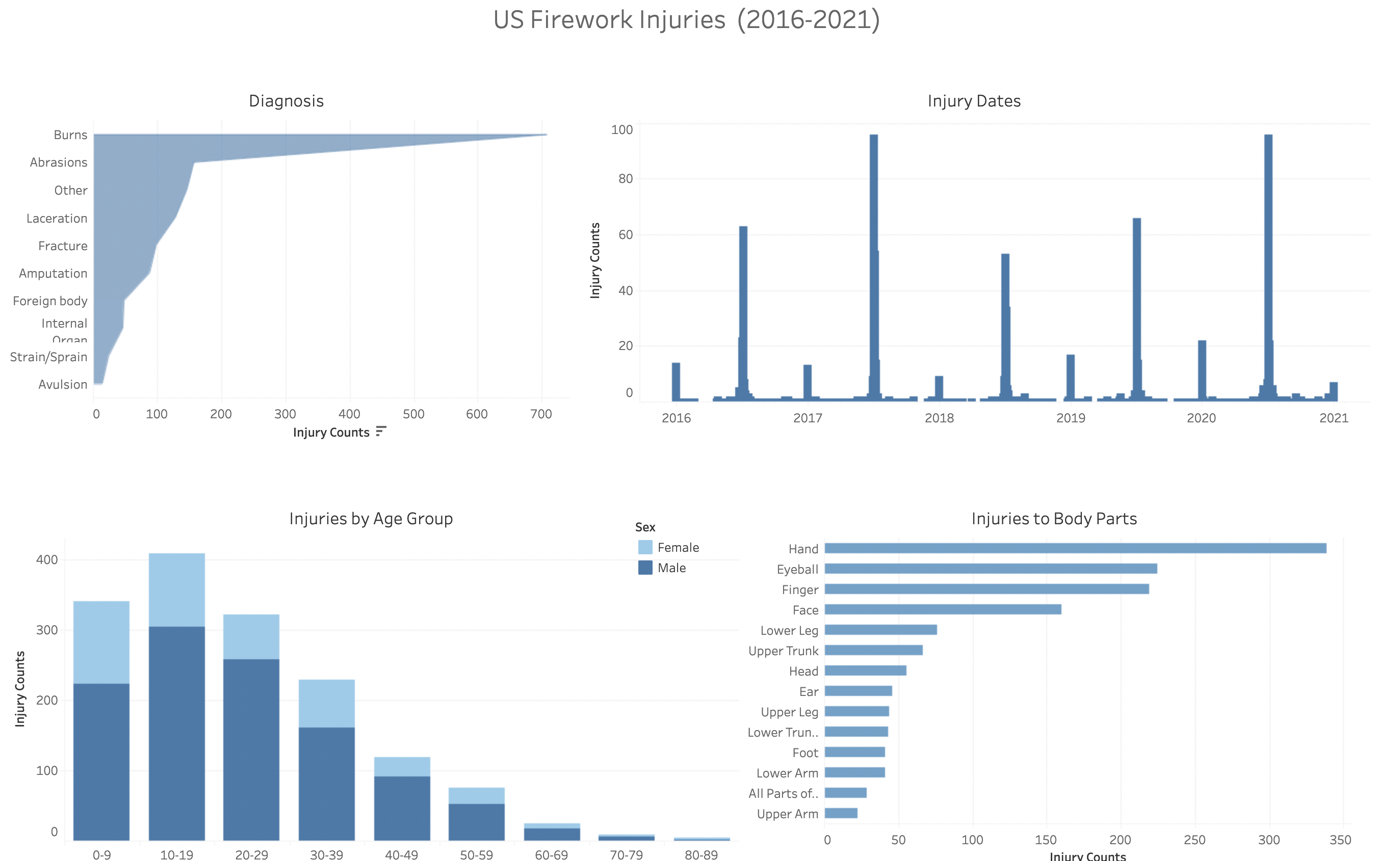
To provide an overview of the types of incidents that involve fireworks. This includes understanding which age groups are most affected and the frequency of injury types. Insights from this analysis may help prevent future injuries or at least assist with increasing awareness of the dangers that fireworks can cause.
In addition to the above analysis, we'll take a look into sales data for all US states for the last five years (2016-2021).
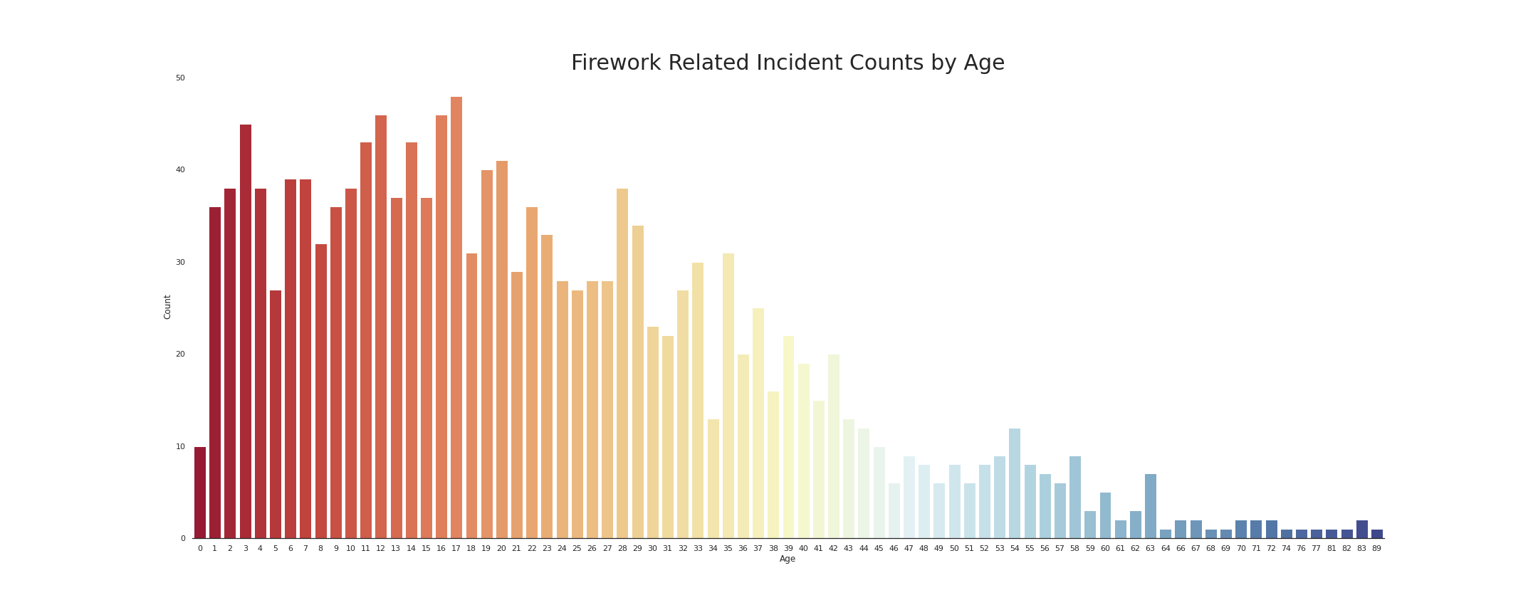
Age group of 0-20 showed the highest rate of injury.
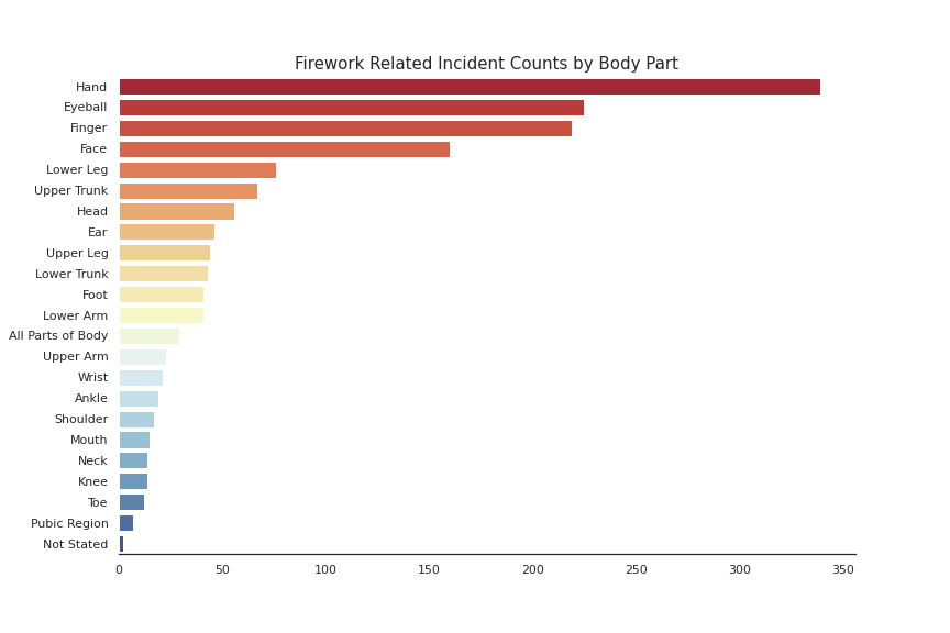
Injuries to the hands, face, and eyes were the most common, while injuries to lower extremities were less common.
Missouri held the record for most spent on fireworks (over 250 million dollars over the past 5 years).
%202016-2020%20(map).png)
There was no significate correlation between the number of injuries in a year compared to the number of sales.
# install libraries to save plotly images to disk
%%capture
!pip install kaleido
!pip install plotly>=4.0.0
!wget https://github.com/plotly/orca/releases/download/v1.2.1/orca-1.2.1-x86_64.AppImage -O /usr/local/bin/orca
!chmod +x /usr/local/bin/orca
!apt-get install xvfb libgtk2.0-0 libgconf-2-

!pip install texthero
import matplotlib.pyplot as plt
import numpy as np
import pandas as pd
import plotly.express as px
import seaborn as sns
import texthero as hero
from texthero import preprocessing
from texthero import stopwords
import warnings
warnings.filterwarnings('ignore')
# Import clean injury dataframe
injury = 'https://github.com/drusho/fireworks_data_exploration/raw/main/data/data_clean/df_injury_clean.csv'
df_injury = pd.read_csv(injury,usecols=[1,2,3,4,5,6,7,8,9,10])
df_injury.head(3)
#Time Series Analysis of Injuries (Scatter Plot)
#groupby treatment
injury_dates = df_injury.groupby('Treatment_Date').count().reset_index()
injury_dates = injury_dates.rename(columns={'Age':'Count'})

fig = px.scatter(injury_dates, x="Treatment_Date", y="Count")

fig.update_layout({"plot_bgcolor":"rgba(255,255,255, 0.9)"},
                  title={'text': "Firework Injury Counts by Date",
                  'y':.98,
                  'x':.5,
                  'xanchor': 'center',
                  'yanchor': 'top'},
                  xaxis=dict(title='Date of Injury'),
                  yaxis=dict(title='Injury Counts'))

fig.update_traces(marker_color='#1f77b4')

fig.show()
#create a custom cleaning pipeline
custom_pipeline = [preprocessing.fillna
                   , preprocessing.lowercase
                   , preprocessing.remove_digits
                   , preprocessing.remove_punctuation
                   , preprocessing.remove_diacritics
                   #, preprocessing.remove_stopwords
                   , preprocessing.remove_whitespace]
                  #  , preprocessing.stem]

#pass the custom_pipeline to the pipeline argument
df_injury['clean_nar'] = hero.clean(df_injury['Narrative'], pipeline = custom_pipeline)

#add a list of stopwords to the stopwords
default_stopwords = stopwords.DEFAULT

#Call remove_stopwords and pass the custom_stopwords list
custom_stopwords = default_stopwords.union(set(["'","I","r","dx","i","l","yom","yow","pt","type","p","w"]))

df_injury['clean_nar'] = hero.remove_stopwords(df_injury['clean_nar'], custom_stopwords)

tw  = hero.visualization.top_words(df_injury['clean_nar']).head(20).reset_index()

fig = px.bar(tw,
             x='index',
             y='clean_nar',
             orientation='v')

fig.update_layout({"plot_bgcolor":"rgba(255,255,255, 0.9)"},
                  title={'text': "Word Frequency for Injury Reports (2016-2021)",
                  'y':.98,
                  'x':.5,
                  'xanchor': 'center',
                  'yanchor': 'top'},
                  xaxis=dict(title=''),
                  yaxis=dict(title='Word Counts'))

fig.update_traces(marker_color='#1f77b4')

fig.show()
#Wordcloud from Narrative column using hero

hero.wordcloud(df_injury['clean_nar'], max_words=200,contour_color='',
               background_color='white',colormap='Blues',
               height = 500,width=800)

#define figure size
sns.set(rc={"figure.figsize":(15, 6)})

#set background to white
sns.set_style("white")

fig, ax = plt.subplots(1,2)

sns.countplot(df_injury['Drug'],
              ax=ax[0],
              palette="Oranges_r")

ax[0].set_title('Drug Related Incidents',
             fontdict = {'fontsize': 15})
ax[0].set(ylabel='Counts',
       xlabel='')

sns.countplot(df_injury['Alcohol'],
              ax=ax[1],
              palette="Blues_r")

ax[1].set_title('Alcohol Related Incidents',
             fontdict = {'fontsize': 15})
ax[1].set(ylabel='',
       xlabel='')

# remove spines
sns.despine(left=True)

#save to png
# fig.savefig("Drug/Alcohol Counts.png")

plt.show()
fig.savefig('Drug_and_Alcohol_Counts.png')

plt.show()

# Incident Counts by Year BarGraph

#define figure size
sns.set(rc = {"figure.figsize":(12,8)})

#set background to white
sns.set_style("white")

treamentDates = df_injury['Treatment_Date'].dt.year.value_counts().sort_index().reset_index()

ax = sns.barplot(y="Treatment_Date",
                 x="index",
                 data=treamentDates,
                 palette="Blues")

#set x,y labels
ax.set(xlabel='',
       ylabel='Incident Counts')

#set titles
ax.set_title('Firework Injury Counts by Year',
             fontdict = {'fontsize': 15})

#remove spiens
sns.despine(left=True)

#save to png
ax.figure.savefig("Firework Injury Counts by Year.png")

plt.show()

# Incident Counts by Sex

incidentSex = df_injury['Sex'].value_counts().reset_index(name='incidents')

#define figure size
sns.set(rc={"figure.figsize":(12, 8)})

#set background to white
sns.set_style("white")

ax = sns.barplot(x="incidents",
                 y="index",
                 data=incidentSex,
                 palette="Blues_r")

#set x,y labels
ax.set(xlabel='',
       ylabel='Injury Counts')

#set titles
ax.set_title('Firework Injury Counts by Gender (2016-2020)',
             fontdict = {'fontsize':15})

#remove spines
sns.despine(left=True)

#save to png
ax.figure.savefig("Firework Injury Counts by Gender.png")

plt.show()

# Incident Counts by Body Part

#define figure size
sns.set(rc={"figure.figsize":(12,8)})

#set background color
sns.set_style("white")

incidentBp = df_injury['Body_Part'].value_counts().reset_index(name='incidents').head(23)

ax = sns.barplot(x="incidents",
                 y="index",
                 data=incidentBp,
                 palette="Blues_r")

#set x,y labels
ax.set(xlabel='',
       ylabel='')

#set title
ax.set_title('Firework Injury Counts by Body Part (2016-2020)',
             fontdict = {'fontsize':15})

#remove spines
sns.despine(left=True)

#save to png
ax.figure.savefig("Incident Counts by Body Part.png")

plt.show()

# Histogram of Ages

#set figsize
sns.set(rc={"figure.figsize":(8, 8)})

#set background color
sns.set_style("white")

ax = sns.histplot(data=df_injury,
                  x='Age_Fix',
                  bins=5)

#set x,y labels
ax.set(xlabel='Age',
       ylabel='Counts')

#set title
ax.set_title('Firework Injury Counts by Age (2016-2020)',
             fontdict = {'fontsize':15})

#remove spines
sns.despine(left=True)

#save to png
ax.figure.savefig("Incident Counts by Age_Hist.png")

plt.show()

# Incident Counts by Age (Age_Fix)

#define figure size
sns.set(rc={"figure.figsize":(30, 12)})

#set background color
sns.set_style("white")

incidentAge = df_injury['Age_Fix'].value_counts().reset_index(name='incidents')

ax = sns.barplot(y="incidents",
                 x="index",
                 data=incidentAge,
                 palette="Blues_r")

#set x,y labels
ax.set(xlabel='Age',
       ylabel='Count')

#set title
ax.set_title('Firework Injury Counts by Age (2016-2020)',
             fontdict = {'fontsize':30})

#remove spines
sns.despine(left=True)

#save to png
ax.figure.savefig("Incident Counts by Age_Bar.png")

plt.show()

# Swarm graph by age, year, and gender

#define figure size
sns.set(rc={"figure.figsize":(14,10)})

#set background color
sns.set_style("white")

ax = sns.swarmplot(data = df_injury,
                   x = df_injury['Treatment_Date'].dt.year,
                   y = "Age_Fix",
                   hue = "Sex",
                   palette = "Blues_r")

#set x,y labels
ax.set(xlabel = 'Year',
       ylabel = 'Age')

#set title
ax.set_title('Firework Injury Counts by Age',
             fontdict = {'fontsize':18})

#remove spines
sns.despine(left=True)

#save to png
ax.figure.savefig("Incident Counts by Age_Swarm.png")

plt.show()

# Incident Counts by Diagnosis

incidentDia = df_injury['Diagnosis'].value_counts().reset_index(name='incidents').head(10)

#define figure size
sns.set(rc={"figure.figsize":(14,10)})

#set background color
sns.set_style("white")

ax = sns.barplot(x = "incidents",
                 y = "index",
                 data = incidentDia,
                 palette = "Blues_r")

#set x,y labels
ax.set(xlabel = '',
       ylabel = '')

#set title
ax.set_title('Firework Injury Counts by Diagnosis (2016-2020)',
             fontdict = {'fontsize':18})

#remove spine
sns.despine(left=True)

# #set y axis labels (shortened longer labels to fit for print out)
# ax.set_yticklabels(['Burns', 'Contusions', 'Abrasions','Other/Not Stated',
#                     'Laceration','Fracture','Amputation','Foreign body',
#                     'Internal organ','Strain or Sprain','Avulsion',
#                     'Anoxia','Puncture','Poisoning','Dermatitis', 'Conjunctivitis',
#                     'Concussions','Hematoma'])

#save to png
ax.figure.savefig("Incident Counts by Diagnosis.png")

plt.show()

sales_state = 'https://github.com/drusho/fireworks_data_exploration/raw/main/data/data_raw/State%20Imports%20by%20HS%20Commodities.csv'
df_sales_st = pd.read_csv(sales_state,skiprows=4,usecols=[0,1,2,3])
df_sales_st.head()
#WebScrap State Abbreviations

#scrap state names and abbrev
states_abrev = pd.read_html('https://abbreviations.yourdictionary.com/articles/state-abbrev.html')[0].iloc[1:,:2]

#scrap US territory names and abbrev
territories = pd.read_html('https://abbreviations.yourdictionary.com/articles/state-abbrev.html')[1].iloc[[2,5],:2]

#merge dfs
st_at = states_abrev.merge(territories,how='outer').sort_values(by=0).reset_index(drop=True)

#rename cols
st_at.rename(columns={0:'State',1:'Abbrevation'},inplace=True)

st_at.head()
#merge abbrevation with state sales data
df_sales_st2 = df_sales_st.merge(st_at,how='inner')

df_sales_st2.head()
# Visualization State Sales (Bar Plot)
st_sales = df_sales_st2.copy()

st_sales = st_sales.groupby('State')['Total Value ($US)'].sum().reset_index(name='Sales').sort_values(by='Sales',ascending=False).reset_index(drop=True).head(20)

st_sales.sort_values(by='Sales',ascending=True,inplace=True)

fig = px.bar(st_sales,
             y='State',
             x='Sales',
             orientation='h',
             color_continuous_scale='Blues',
             color="Sales")

fig.update_layout({"plot_bgcolor":"rgba(255,255,255, 0.9)"},
                  title={'text': "Firework Total Sales ($USD) 2016-2020",
                  'y':.98,
                  'x':.5,
                  'xanchor': 'center',
                  'yanchor': 'top'})

fig.show()

# # save fig to image
# fig.write_image("Total Firework Sales ($USD) 2016-2020.png", width=1980, height=1080)

# fig.write_html("Total Firework Sales ($USD) 2016-2020.html")
# Visualization State Sales (Scatter Plot)

df_sales_st2.sort_values(by='State',ascending=False,inplace=True)

fig = px.scatter(df_sales_st2,
                 y="State",
                 x="Time",
                 color="Total Value ($US)",
                 size='Total Value ($US)',
                 width=800, height=1100,
                 color_continuous_scale='Blues')

#change background and legend background to white
fig.update_layout({"plot_bgcolor":"rgba(255,255,255, 0.9)"},
                  #  "paper_bgcolor": "rgba(255,255,255, 0.9)"},
                  title={'text': "Firework Sales ($USD)",
                         'y':.98,
                         'x':.5,'xanchor':'center',
                         'yanchor': 'top'},
                  xaxis=dict(title=''),
                  yaxis=dict(title=''))

fig.show()

# save fig to image
fig.write_image("Firework Sales ($USD) (scatter_plot).png", width=800, height=1000)

fig.write_html("Firework Sales ($USD) (scatter_plot).html")
fig = px.choropleth(df_sales_st2,  # Input Pandas DataFrame
                    locations="Abbrevation",  # DataFrame column with locations
                    color="Total Value ($US)",  # DataFrame column with color values
                    hover_name="Abbrevation", # DataFrame column hover info
                    locationmode = 'USA-states', # Set to plot as US States
                    color_continuous_scale='Blues')

fig.update_layout(
    title={
        'text': "Firework Total Sales ($USD) 2016-2020",
        'y':.95,
        'x':.5,
        'xanchor': 'center',
        'yanchor': 'top'},
    geo_scope='usa')  # Plot only the USA instead of globe

fig.show()

# save fig to image
fig.write_image("Total State Firework Sales ($USD) 2016-2020 (map).png",
                width=1980,
                height=1080)
fig.write_html("Total State Firework Sales ($USD) 2016-2020 (map).html")
# Total Sales groupby Year
sales_year = df_sales_st2.groupby(df_sales_st2['Time'].dt.year).sum().reset_index(drop=False)
sales_year.rename(columns={'Time':'Year','Total Value ($US)':'Sales'},inplace=True)
sales_year
# df_injury.groupby(['Treatment_Date']
df_injury_count = df_injury.groupby(df_injury['Treatment_Date'].dt.year)['Age'].count().reset_index(name='Count')
df_injury_count.rename(columns={'Treatment_Date':'Year'},inplace=True)
df_injury_count
# Merge sales and injury dfs on year
df_merged = sales_year.merge(df_injury_count,how='left')
df_merged
# Correlation
df_merged.corr()
Injuries
Age groups of 0-20 showed the highest rate of injury. Injury rates by age decrease with age tend to slowly decrease after age 20. The 60+ age groups showed the lowest rate of injury.
Injuries to the hands, face, and eyes were the most common, while injuries to lower extremities were less common. This is reflected numerous times in the data, such as with word frequency of injury narratives, where an explanation is given for how a person was injured.
Time series analysis showed that the month of July has the highest frequency of firework related injuries.
Sales
Missouri held the record for most spent on fireworks (over 250 million dollars over the past 5 years). For comparison, Alaska spent around 560,000 dollars in the last five years. Sales for fireworks saw a considerable increase in sales during 2020, most likely due to COVID-19.
Correlation Between Sales and Injury Counts
There was no significate correlation between the number of injuries in a year compared to the number of sales.
Ending Remarks
Never hold fireworks while lighting them, and hand, eye, and face protection should be worn at all times when fireworks are nearby fireworks. This is especially true if you are a male below the age of 21.
Resources
National Fire Protection Association: Fireworks fires and injuries